Responsive web development - my portable device lab.
rwd responsive web design
I have been doing responsive web developement and design for quite some time now. All the time I still see people not getting it. People satisfied with implementing some break points, resizing the browser and stop at that. Thing is, we all started that way, at least I did. So I will tell you my progress over the years, doing responsive developement.
2009
At first I simply was satisfied with resizing the screen. That worked for a bit, as in those days, we simply didn't know any better. And if we did anything responsive it sure beat the fixed width design they had. Some of the time I played with my shiny iPhone 3g, seeing how it looked in there. I had no other phones and was (mistakenly) convinced that all webkits were created equal.
Things changed when a co worker brought his new Android in to the office and yet another bought a blackberry. It seemed that things weren't that simple anymore...
But still it was custom for us to simply change the window width and leave it at that. Clients cared only for iPhones, if they cared at all. Most of them simply built a mobile version of their website, despite what we tried to tell them.
2010
The iPad sure as hell pleased us, it was new, it was shiny and it worked like a charm.The one browser dominating the mobile space as well as chrome conquering the world let us write for one browser and one alone. At least, that is what some of us did. All we needed was -webkit and all was well.
At least it seemed that way, some of us discovered other browsers and different devices. Those people, not all of them, wrote code to work in more than one browser. That made it more work, but also more fun.
2013
In this day responsive web design has become the new Ajax, as it's a buzz word anybody wants. Most people don't know what it means and simply want a) a smaller sized desktop site or b) a stripped down version of that same site.
Some people have heard of 'mobile first', but most still don't understand it. Most of the big clients I worked for in the past few years have something of a device lab, but it is hidden away with the test department. I have yet to see that devices are on the desk with developers and even more important designers.
2014
Thinking that this responsive thing is something with a future I decided to change that. No more hunting for test devices when I am at a project. From now on I will bring my own device lab to clients, that way I can do some real work on those devices all the time. I can develop and test faster and I can show to the designers right away what their design is doing on those devices.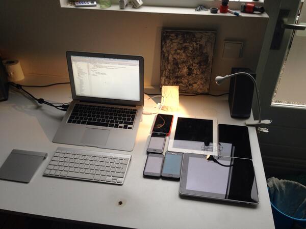
So if you are going to hire me, be warned. I come with a minimum of 10 devices so I need a big desk and plenty of power sockets for these. Put me right between the other developers and the designers and tell them I can be asked questions. If you give me the chance I will teach people all I know about doing development for these devices.
As a bonus, I can talk to business and marketing people, some times without shouting, trying to educate those people as well. So if you want someone helping you with responsive web development, try and hire me, I will be happy to help.
The devices
Here a small and incomplete sampling of the devices I carry with me.
- Nokia 625 - Windows
- iPhone 3g - iOs
- iPad (original) - iOs
- Samsung Galaxy S2 - Android
- iPad (retina) - iOs
- Nexus 7 - Android
There are still some things missing, I have no Firefox phone and am looking at a Nokia Asha 501. New Android phablets are on my list too as more Windows devices. If you have any spare ones, donations are more than welcome...
Be warned, the number of devices will grow, so the amount of desk space needs te be bigger as the time goes by...